Good Signs, Bad Signs
When you work in the marketing, branding and design business, you tend to take notice of signage. Lately, due to COVID-19, there’s been an increased reliance on signs for open hours, way-finding, new rules and new services.
You get what I’m laying down here? I’m sorry, but Microsoft Word, Times New Roman, and your 8.5 x 11 printer paper likely isn’t cutting it…
Check out some of these mind blowing signage stats below:
According to Visual Logistix, 68% of customers believe that signage reflects the quality of a business and their product.
On average, one additional on-premise sign results in an increase in annual sales revenue of 4.75%
Based on a survey conducted by FedEx, nearly 75% indicated that they had told others about a business simply based on its signage.
Good signage really works.
Bad signs, on the other hand (we’ll get you some examples here soon) can do more harm than good for your business. According to a survey done by FedEx, over 50% of respondents indicated that poor signage (e.g., poor quality, misspelled words) deters them from entering a place of business. Your customers are holding you to a certain level of standard, and it doesn’t just come down to the quality of the product(s) you are offering. It’s about reputation. It’s about your brand as a whole.
Good Signage
Check out this one by Tim Hortons. The signage was creative, the quality was exceptional (not wearing down in high-traffic areas), brand colors/fonts were consistent, and ultimately got the message across to the customer.
Bad Signage
Here’s some “not-so-good” signage from well-known, Canadian department store. While I was visiting one of their stores a few weeks back, I was perplexed by the signage they had for being such a large company. I want to point a few things out:
This was off-the-shelf construction tape
The arrows were wearing off in high traffic areas
There was no further explanation from what I could find
The arrows started appearing after I was already in the aisle
This signage really made me think about the brand. Something we think as so minor had affected the customer shopping experience for me greatly. How was I supposed to find what I was looking for? The bolts I wanted to pick up while there, did I really need to go down and around the other aisle to get to them? Home Depot made it difficult for their customers to shop and didn’t reinforce their safety protocols.
Customer experience impacts your brand.
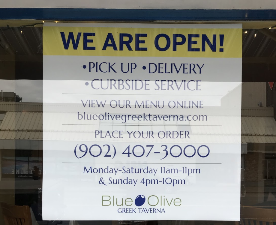
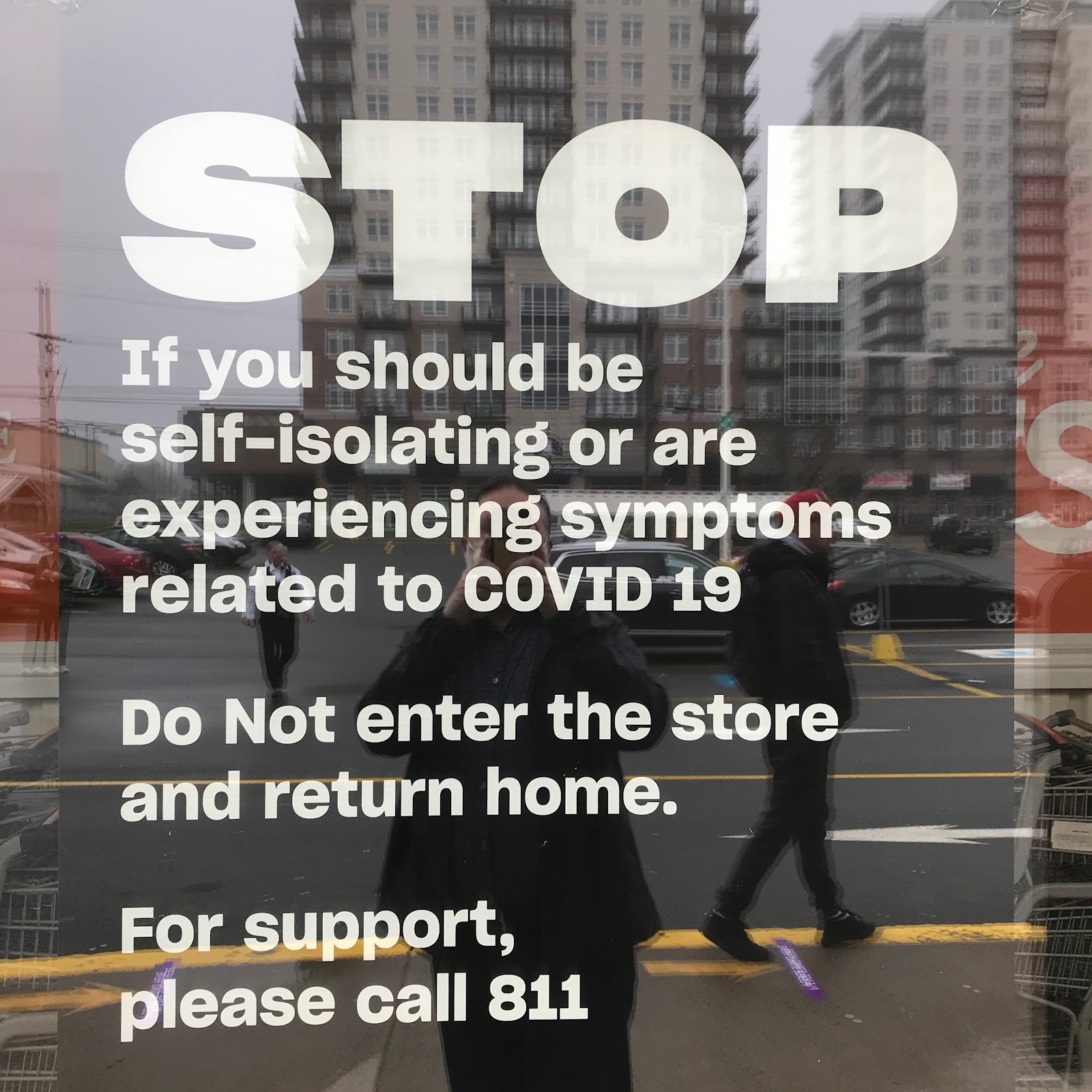
Here are a couple other companies crushing it in the “sign game”:
Atlantic Superstore
Our friendly neighbours at Blue Olive Greek Taverna
Now that we’ve seen a couple good and bad signs, you’ve probably been wondering about your own signs. Here are three things to consider:
What is the quality of your sign? Paper, plastic, metal?
Does it reflect your brand? Fonts, colors, messaging?
How busy is your sign? Are you getting the message across in a short and simple way? Remember - less is more.
Now, as a small/medium sized business, you may be wondering about the price (and you may be surprised). Did you know that social distancing floor stickers can be purchased for less than $5 each? Based on the ROI statistics above and cost of the stickers alone, what’s stopping you from investing in good signage?
Ready to up your signage game? We’ve got creatives in-house and sign printing partners a call away – so drop us a note and let’s get started. 🔥


